Despite streaming services the likes of Netflix and Hulu dominating the media consumption market over the past several years, they still struggle constantly to connect and further engage their platform's audience beyond just the content they provide.
Enter watchr: a solution for binge watchers and casual viewers alike that tracks progress in shows and movies across all services, visualizes users' watch history in a familiar and easily-understandable format, and enables users to give personalized recommendations to friends or even invite others to experience new content alongside them.
An Idea Forms
When we began our Interaction Design class, we were told that we were going to spend the entire semester designing a product of our choosing. My mind immediately turned to the frustrations I faced in finding a solution for keeping track of shows I’ve seen, those I’m watching, and what I want to watch in the future.
Now that the idea was nailed down, it was time to start research. After writing an interview script at the request of the professor, I began using the script to find the pain points people are currently facing with their show watching experiences. Some of the biggest findings were as follows:
- It takes way too much time to search through all of the available options on Netflix or similar streaming services.
- They have problems remembering where they last left off in a show, often having to scrub around the last couple of episodes until they remember a specific moment.
- They have no idea when shows are on or when they premiere, often missing new episodes and having to find a way to catch up.
- They need more compelling evidence to start watching a show rather than a simple rating provided by a service.
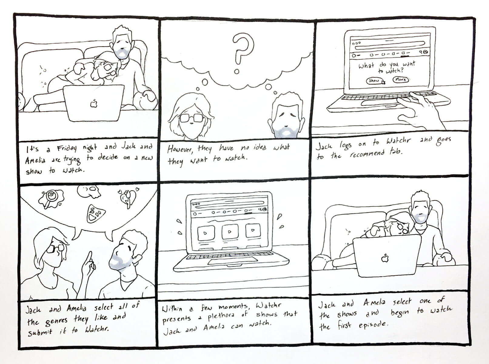
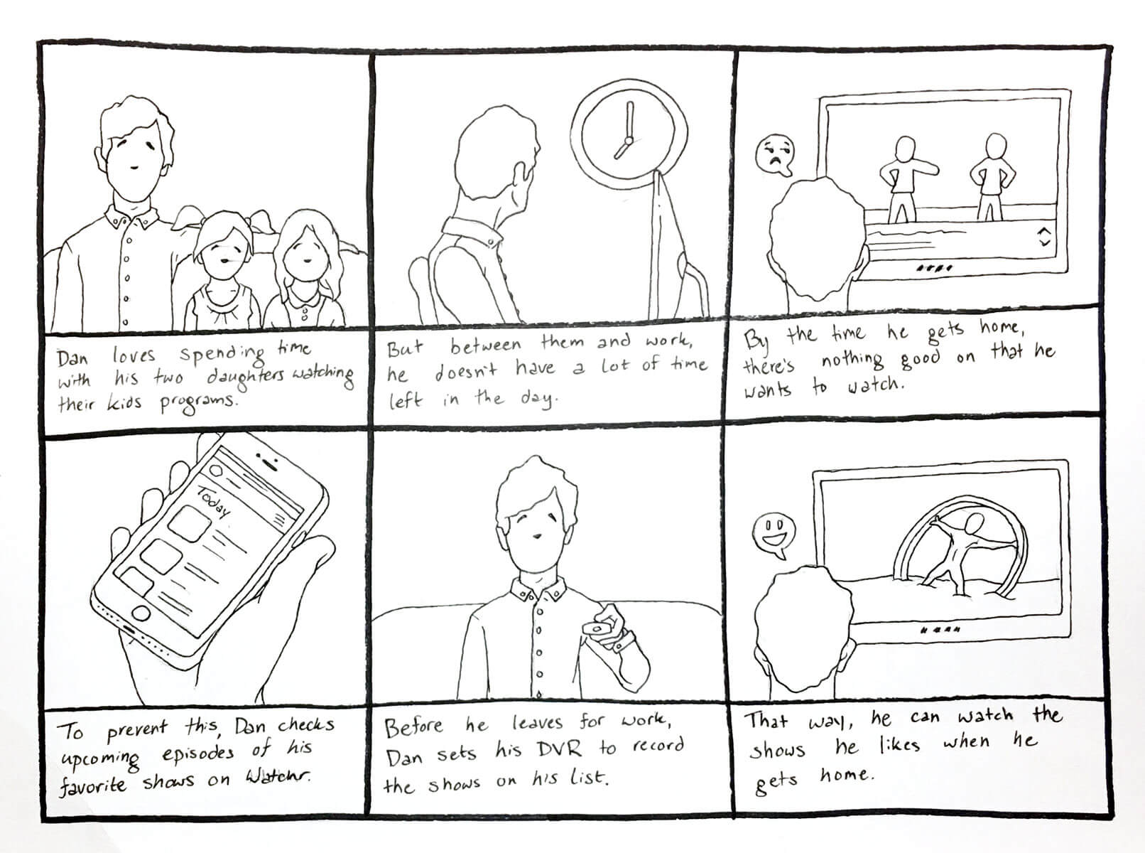
With these pain points in mind, I began constructing some user stories and use cases for the app, turning them into storyboards that can motivate some app flows:
Forming the User Experience
Using the wireframing program Balsamiq, I began designing lo-fi screens for different flows, including searching for new content and updating show progress.
Midway through designing these screens I had a conversation with my professor on why and how people would keep engaged in the app. I already had an idea for being able to see what your friends are watching and how far they are, as a way to provide evidence to users of what they should also be watching. I decided to take this one step further and gamify the app experience, allowing users to gain badges for watching shows and compete with friends in binge watches. With this new outset for the app, I began designing flows surrounding gamification.
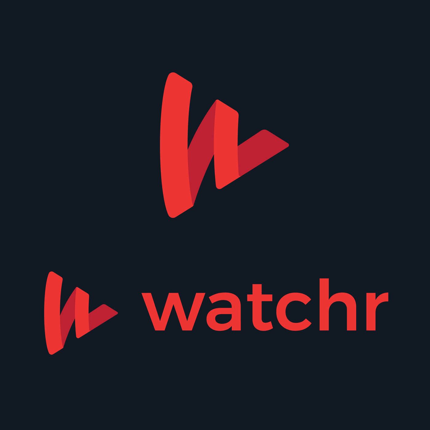
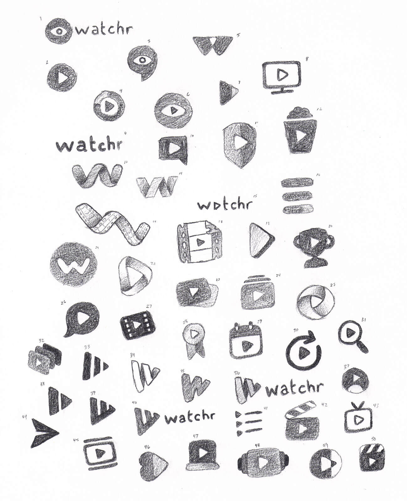
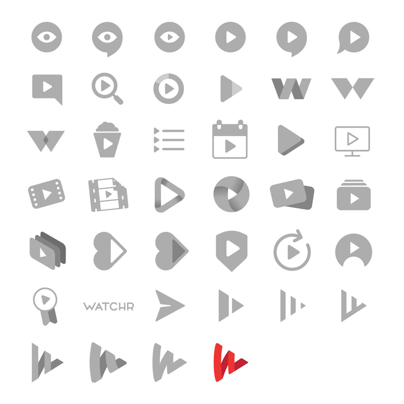
Finding a Logo
You can’t have a product without branding, so our professor challenged us to create 50 logo variations in order to get the ball rolling. Below are the initial sketches I made, as well as digitized versions of each that I made after the course had ended.
In the end, I decided to move forward with a play button formed by watchr’s W. This seemed to strike a chord with my fellow classmates, and fit my idea for the app best. I tried pairing it with a custom logotype, but decided it best to move forward with Montserrat to easily match headings and type in the app.
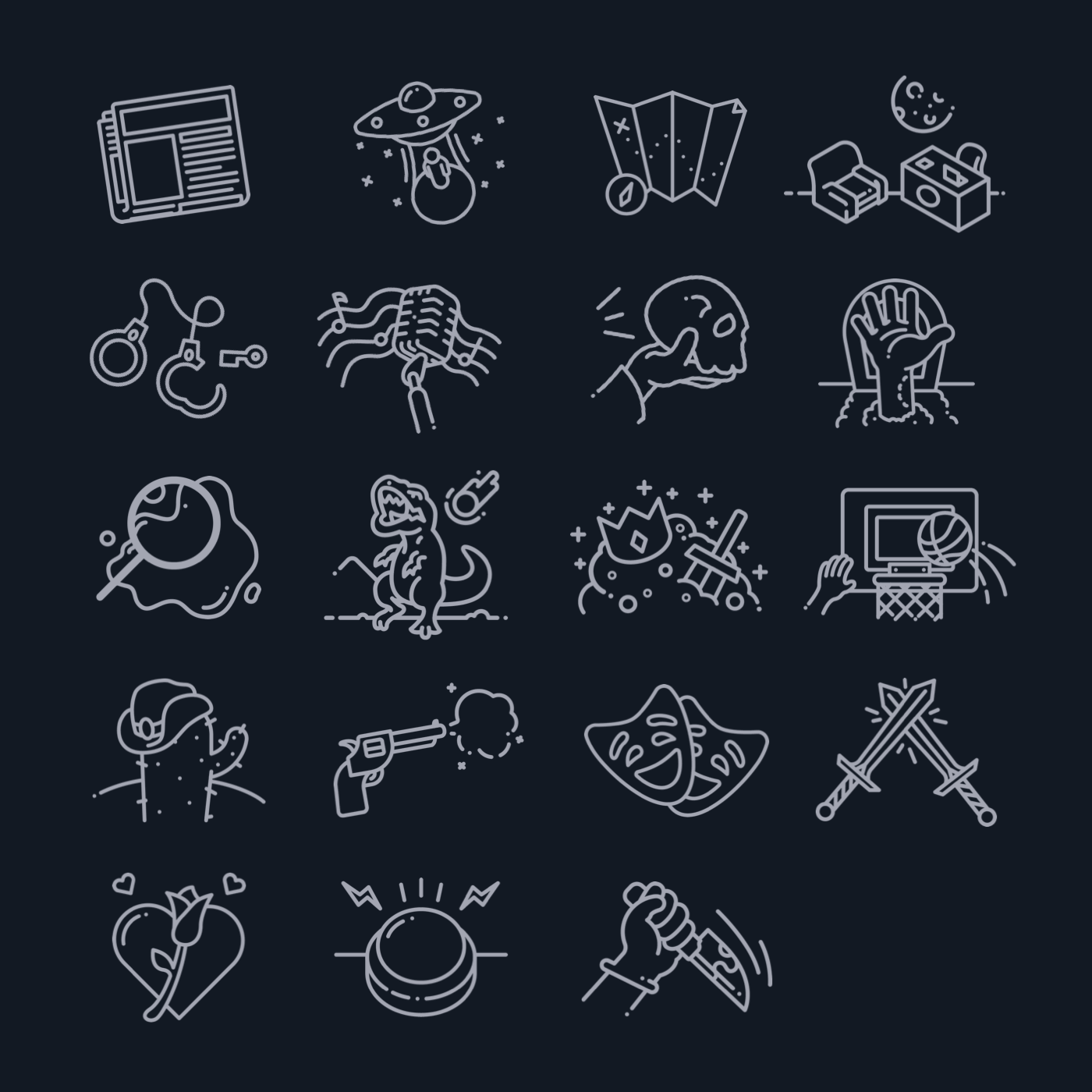
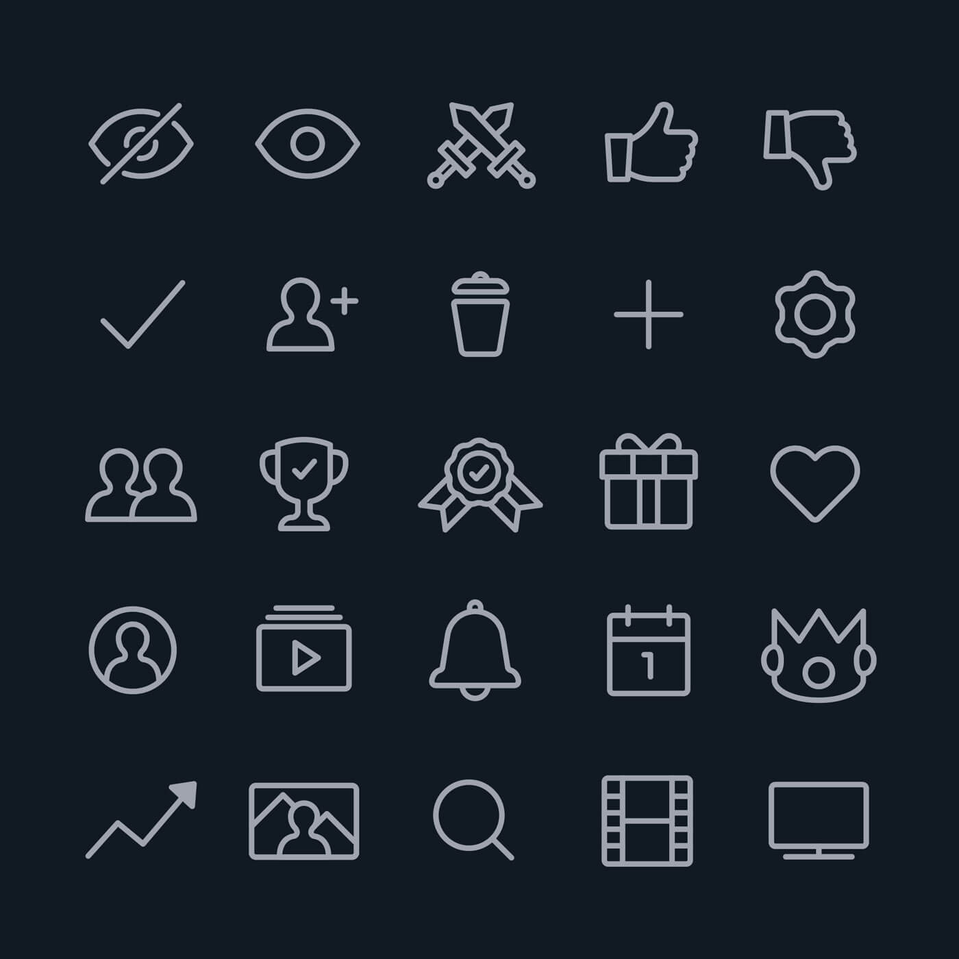
An Illustrative Flair
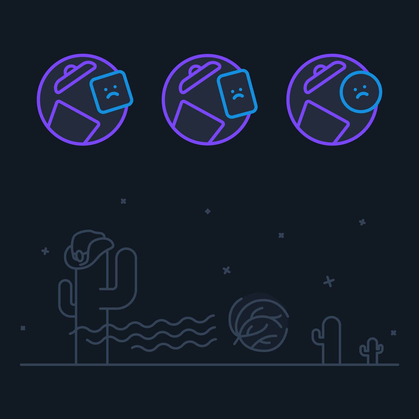
Having spent my entire life in illustration, I knew I wanted to introduce a bit of fun into the app using those abilities. Besides the obvious icon design, I decided to use illustration for the different genres that shows could fall under, empty states across the app, and for providing visual context in modals.
It's Alive!
Despite our professor stating that we only needed to provide an InVision prototype as our final product, I wanted to push my then-newfound web development abilities and build the app. Having never built a user-based app alone, let alone one with dynamic pages and data, I encountered many troubles along the way.
After some initial research on how to dynamically generate pages, I decided to write the app in PHP and hold all the user data in static JSON files. Unaware of JavaScript frameworks like React, I ended up rewriting a basic markup renderer which would dynamically create and update the elements on all pages. While it seemed tedious at the time, this proved quite useful later down the road after discovering React and already knowing how it was able to perform those actions under the hood having done it in this project.

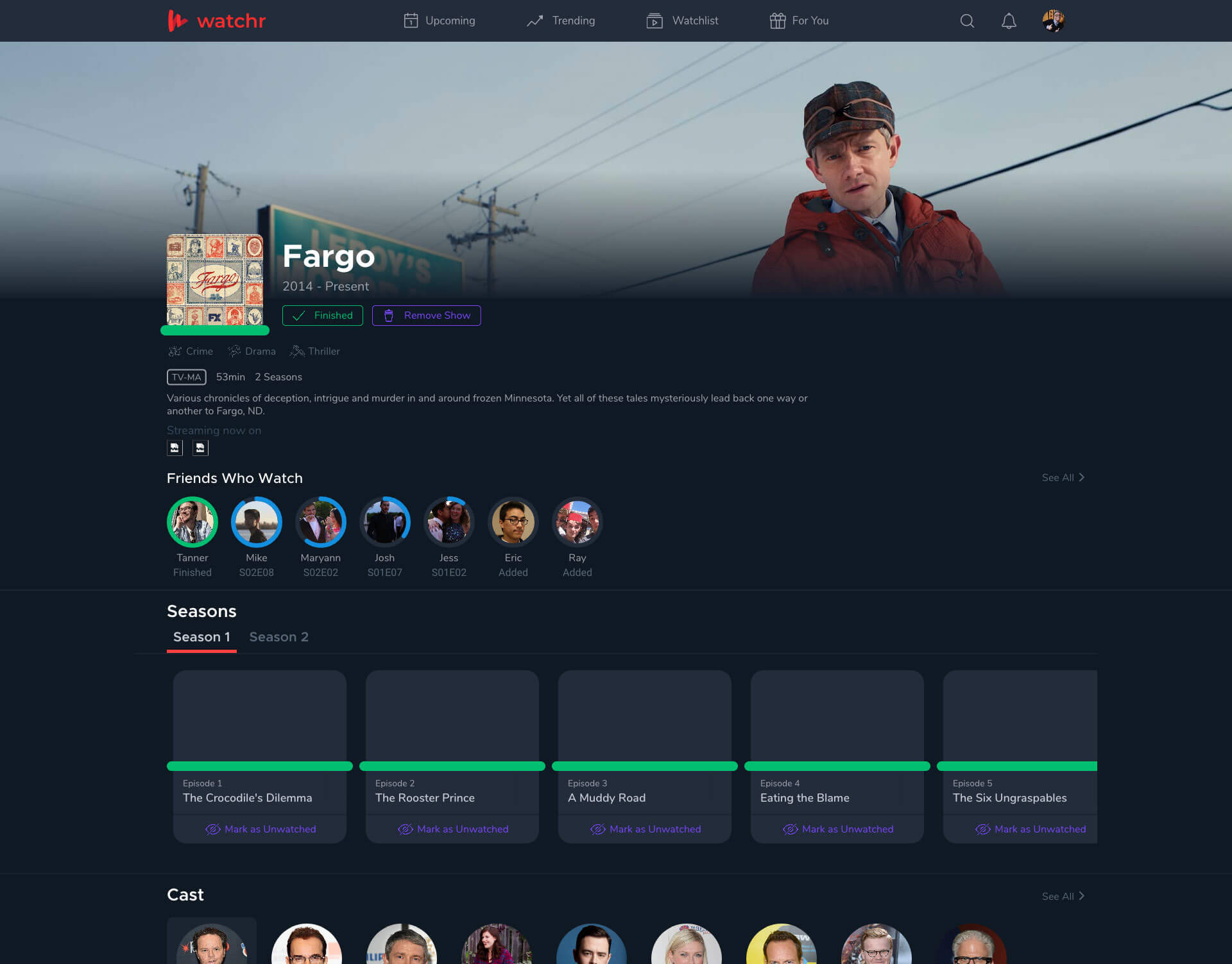
Technical troubles aside, the prototype proved successful in communicating the main flows and goals of the app. I was even able to add micro interactions across the app; my personal favorite exists in the onboarding flow where a heart floats upwards after you double-tap to “love” a genre. You can visit the prototype here.
Moving On
Having been my first real dive into interaction design and real web development, I learned more than I ever could have dreamt of and I’m forever grateful for the experience I gained. I hope to revisit the app one day in the near future, perhaps taking it up as a small weekend project to continue honing my craft.