
Despite its convenience factor, online shopping has a barrage of problems. The lack of a digital fitting room results in purchased clothes either being too large or too small.
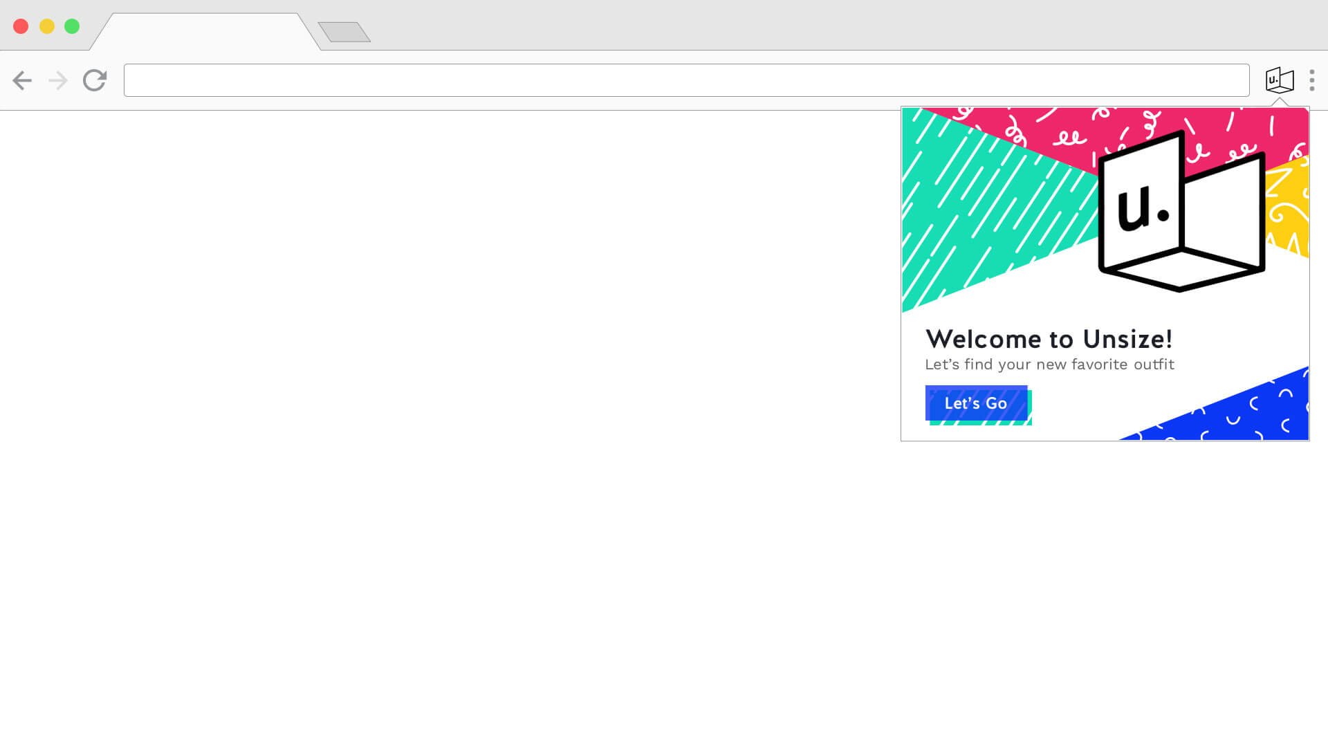
While some retailers try to ease this pain by offering free returns on all items, the process to package, return, and wait to receive the correct size is still way more time-consuming than it would be if you were to just try the item on in-store. Enter Unsize: a new start-up who aims to remove sizes altogether from the digital shopping experience with their smart measuring device, Tailor. This small tool wraps around your body and collects your measurements, sending them wirelessly to your computer to find the best fit for you, all while never revealing your actual numbers.
When Unsize first approached us, they had formed a basic brand and was working on a prototype of the Tailor device. They were happy with their current logo, but needed help expanding their brand to packaging and a website, and finding the best digital experience for using the device.
The Digital Experience
Unsize’s Tailor device was still in the prototype phase when we began speaking with them. From our initial talks with them, they knew that they wanted their device to connect via a Chrome extension, allowing it to provide data to any website. With this, we outlined three things the extension had to do:
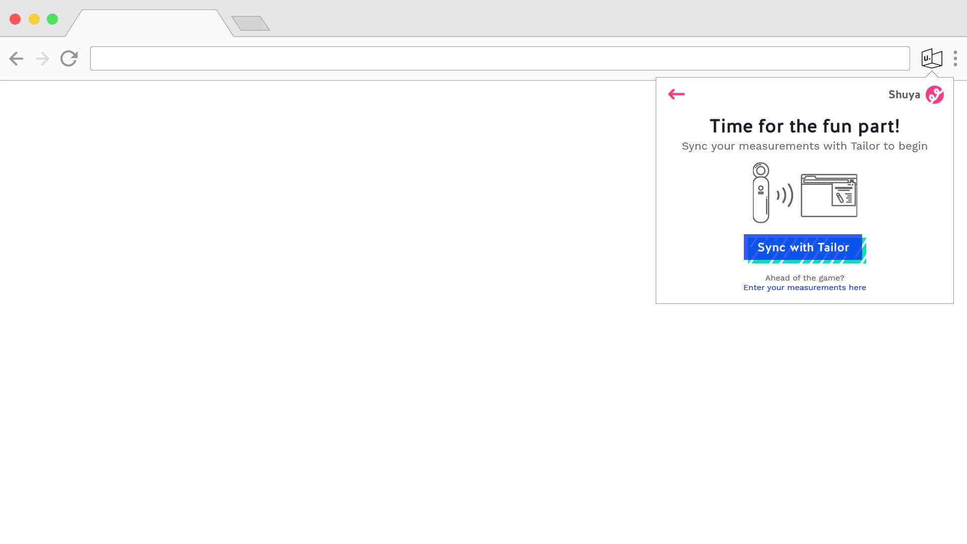
- It should connect to the Tailor device via Bluetooth to receive measurements, and hide those measurements from the user
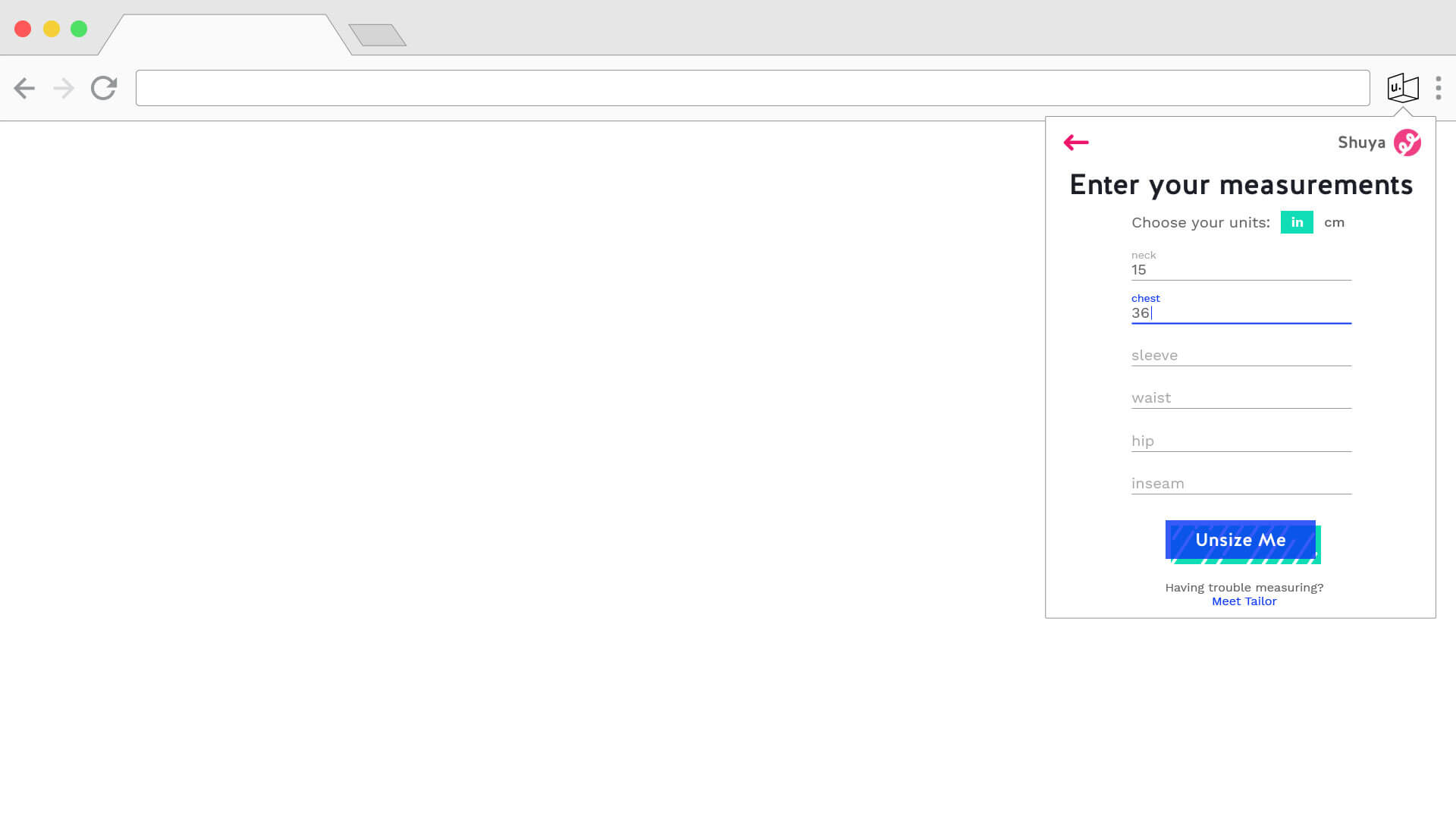
- It should not be limited to those with the Tailor device, and allow users to enter their own measurements if they have.
- It should integrate seamlessly with any personal shopping website, hiding the size that we choose.
While we waited on their team to work on connecting their device to an extension via Bluetooth, we set to work on designing the UX for the extension. With the ability to either connect via Bluetooth or enter measurements manually, we decided on having two separate onboarding flows that would start and end at the same place.
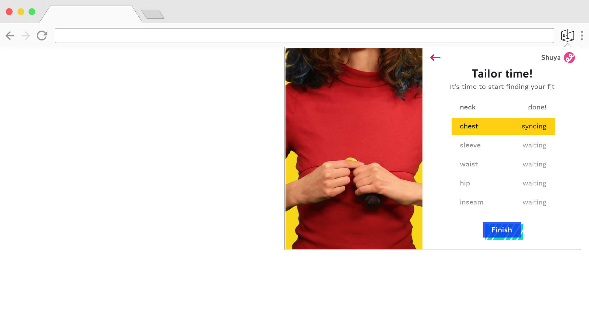
Our main focus was creating the Bluetooth flow, designing the way in which a user could connect to the Tailor device and showing the user how to measure themselves. Working with Scout’s in-house photographer and videographer Zack McCabe, we filmed and edited prototypical video of users measuring themselves with Tailor. The clips were then presented as a how-to guide next to step-by-step instructions for the user on what to measure. Users without the fortune of owning the Tailor device were able to click a de-emphasized button to enter their measurements.
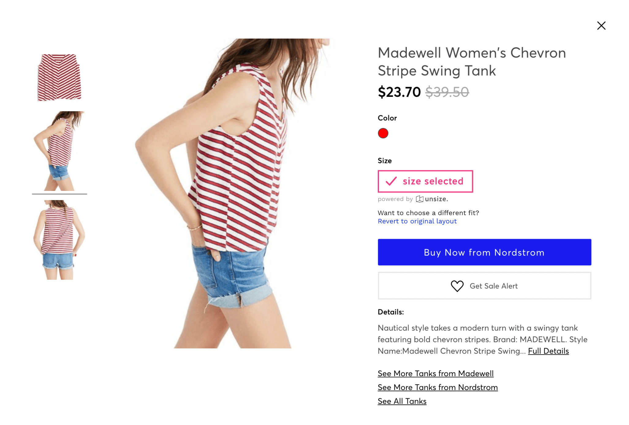
After finishing the onboarding flow, we shifted focus to designing the main experience. While our project lead Adam looked into scraping size charts from the three main online stores Unsize was targeting, we started designing the extension integration with the website. We played with different ways to replace the size selector on an item page to show that Unsize automatically chose your size for you:
Pushing the Brand
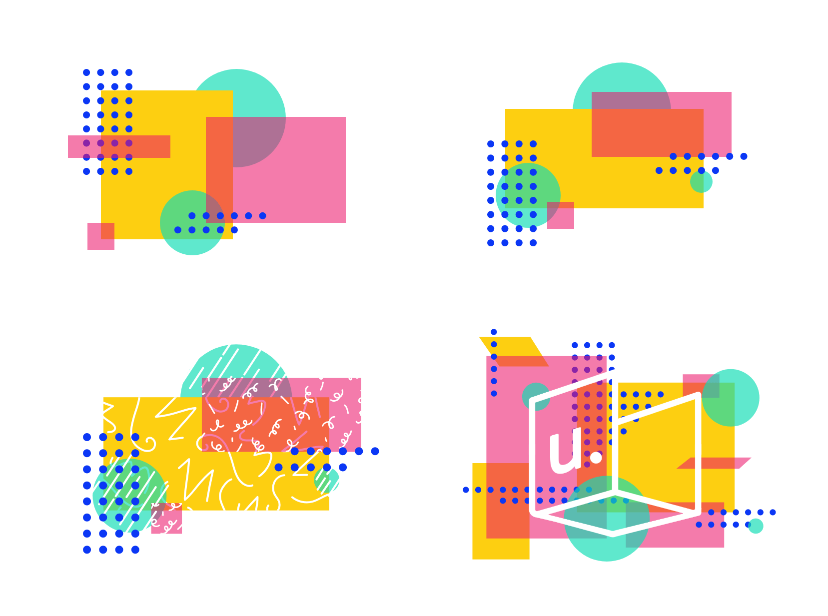
Although Unsize already had an established set of brand guidelines, they came into the engagement knowing the kind of work that Scout produces and wanting to see how we could continue to push their brand. The first attempt at doing so was utilizing their existing brand elements, nicknamed “sprinkles,” and their logo to create some abstract illustrations:
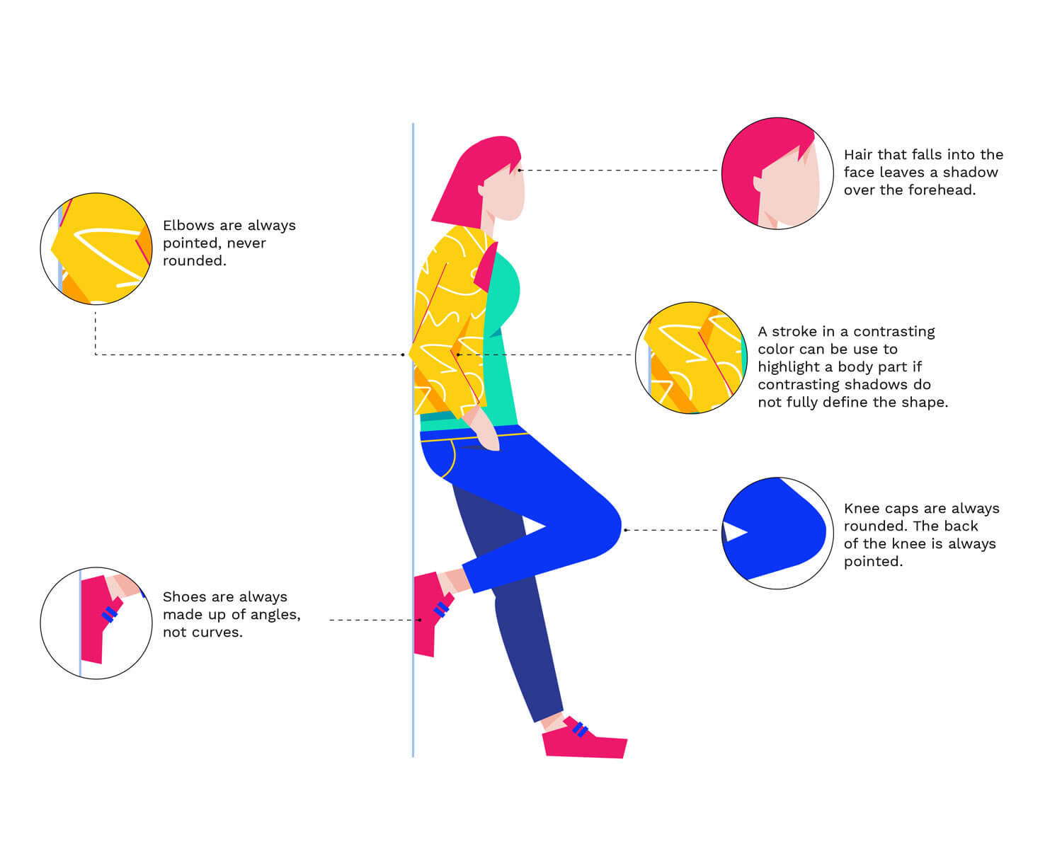
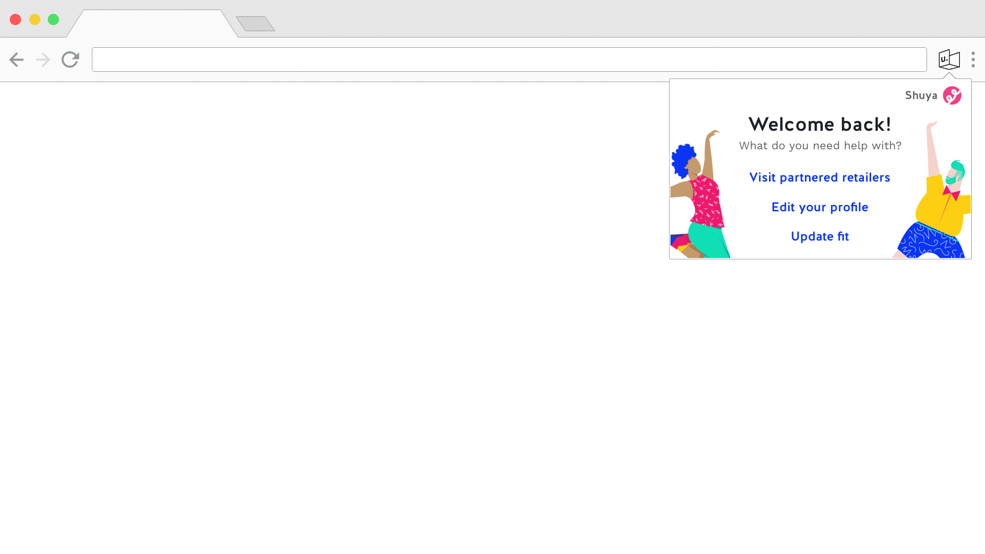
Despite liking the work that was done, they ultimately decided that this wasn’t the right direction for them to move in. From there, we shifted into a more traditional illustration-based approach, creating a variety of characters that they can use across branded material like posters, social media posts, the marketing site, and even the Chrome extension:
Wrapping It Up
Over the course of our engagement with Unsize, we had managed to push their brand in a new illustrative direction; built them a Chrome extension and brand new marketing site; and laid the groundwork for future online store integrations. We were very proud of all the work we did, and Unsize was so appreciative of it that they wrote a Medium post about their time working with us!