Insurance is a wonderful thing: by legally transferring liability to an insurance company, a business can have the peace of mind to take risks and explore new opportunities without the fear of excessive lawsuits.
The problem is the process to buy and renew insurance hasn’t changed in over a hundred years, leaving businesses unprotected for up to twenty weeks as they wait to buy or renew their existing insurance. Enter Wunderite: an online risk profile that expedites the process of getting insurance every year, helping businesses get protected faster so they can do their work without worry.
The Challenge
When Wunderite founder Peter MacDonald first sat down with us, he already had a working prototype of the web platform. This proved to be a huge help in understanding the problems that Wunderite was aiming to solve in the insurance world. However, with a rainbow-mosaic logo and a platform built using Bootstrap, Wunderite was lacking a cohesive image of who they were. We set off to solve this issue in three steps:
- Refresh and expand the current brand and identity
- Redesign and rebuild their existing platform
- Craft a new marketing site to show off the new digs
We had twelve weeks to accomplish everything, and that’s exactly what we did.
Finding a Voice
Insurance is not fun; it’s widely renowned for being the exact opposite of that. Wunderite initially tried to get around this hurdle when they created their rainbow “W” logo. However, while the rainbow proved to be colorful, it leaned too far into childish and playful territory.
When approaching the rebrand, we still wanted to keep the brand fun, but in a more friendly and understated way. We tried to emulate this in a number of different approaches, from geometric folder-like shapes that formed a “W”, to a handwritten logotype made to feel more natural like a signature on a form. After a couple rounds of revisions, we settled on a free-flowing “W” formed by a ribbon-esque stroke.


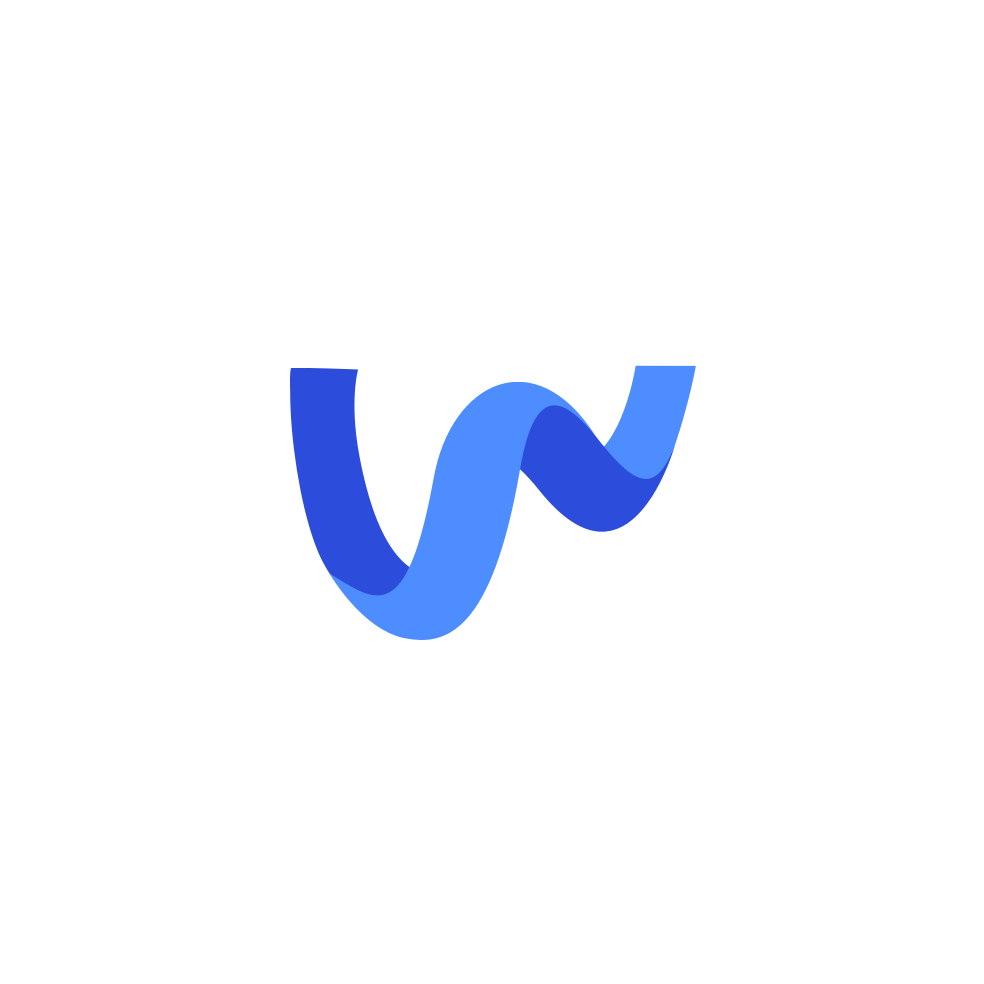
We opted to curve the edges and round the corners of the “W” to give the logomark a little personality of its own. The arms are extended outward, like a person giving a hug or raising the roof. By offsetting the left and right vertices of the “W” by a sizable amount, it looks to be jumping for joy. We liked the idea of introducing more than just a single color, and along the way adopted a neutral blue-to-purple gradient to make the logomark feel like it’s coming off the screen and page. All of this came together to evoke a spirit of openness, celebration, and approachability that will finally get people excited about insurance.
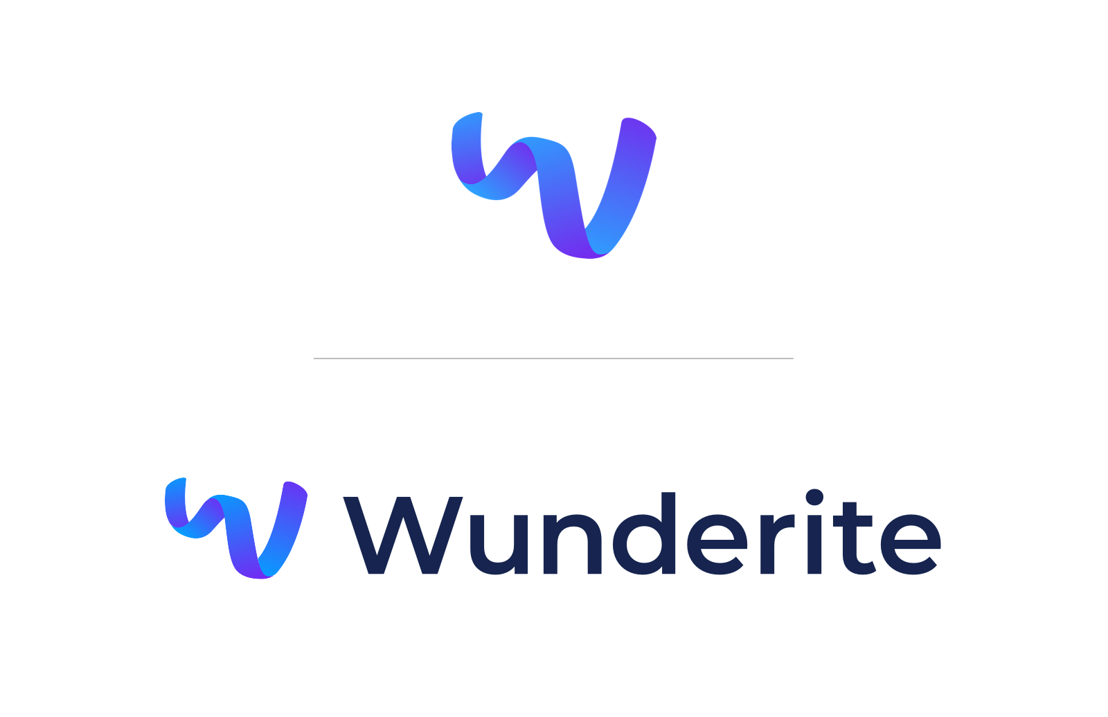
To match the new logomark, we chose Montserrat as the main typeface. Its humanistic characteristics evoke warmth and personality, while the wide shape of the letters match the openness of the logomark. To pair with the loudness of Montserrat, we chose the shier, more understated Open Sans as a body typeface.
A Personalized Experience
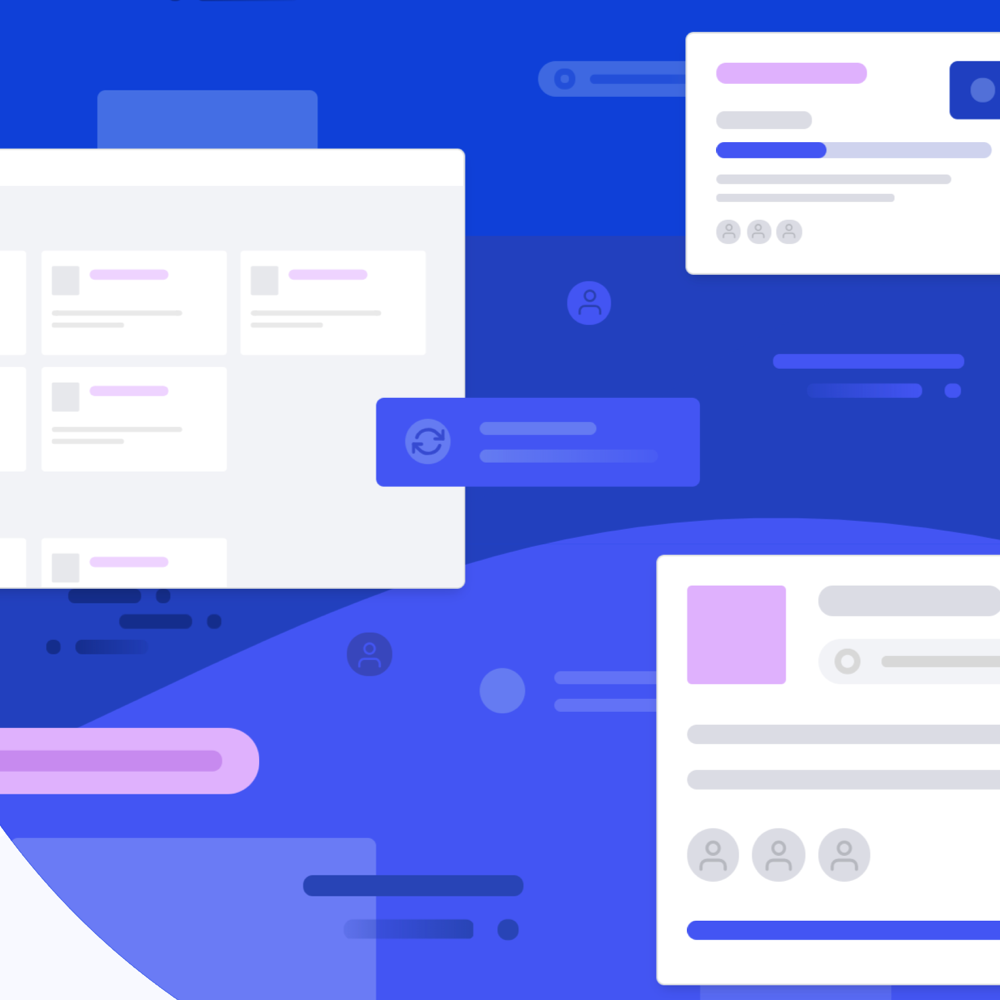
After an audit of the existing platform, we found that the most glaring issue was the lack of a client view. As a broker’s client, the main goal of using the platform is to fill out the minimal information needed to apply for insurance. However, since Wunderite’s existing platform showed the same views to all user types, clients were distracted and overwhelmed by options and actions that only their broker would need to perform or know about. In order to expedite a client’s form-filling process, we knew that we needed to craft two similar but separate experiences.
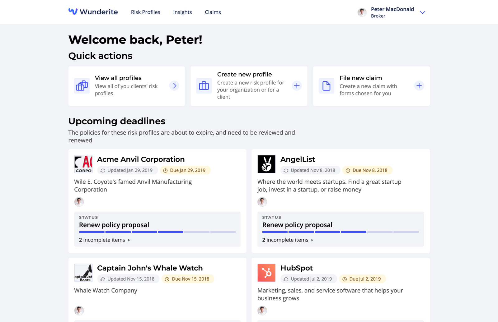
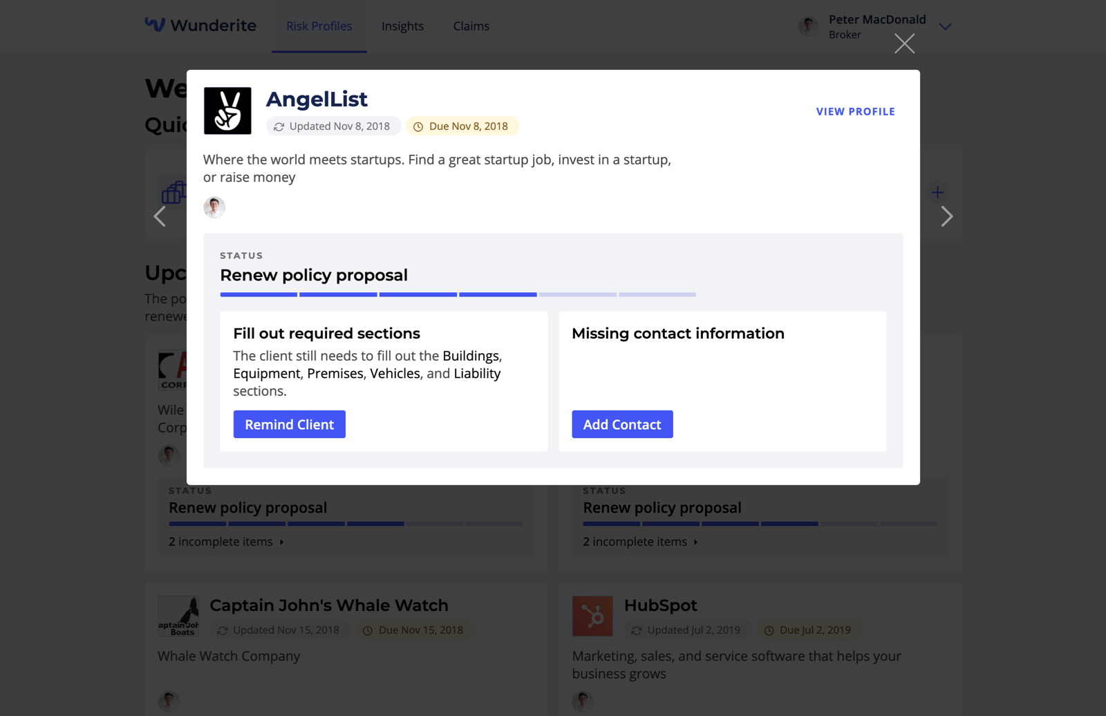
The beginning of both users’ experiences start with a home dashboard, a key element missing from the existing platform. Brokers can find a list of frequently used quick actions, such as creating a new risk profile or filing a claim, at the top of the page. Below these quick actions are two grids of risk profile cards, one organized by approaching deadlines, so that the broker is always on top of things, and the other showing recently viewed profiles. Clicking on a risk profile card presents the broker with a quickview of the profile and some required actions, allowing them to jump right in or quickly exit and move to the next one. Clients, on the other hand, can find an assortment of status cards across the page, ranging from important actions requested by their broker, required fields that still need to be filled out, or updates to filed claims.
Streamlined Form-filling
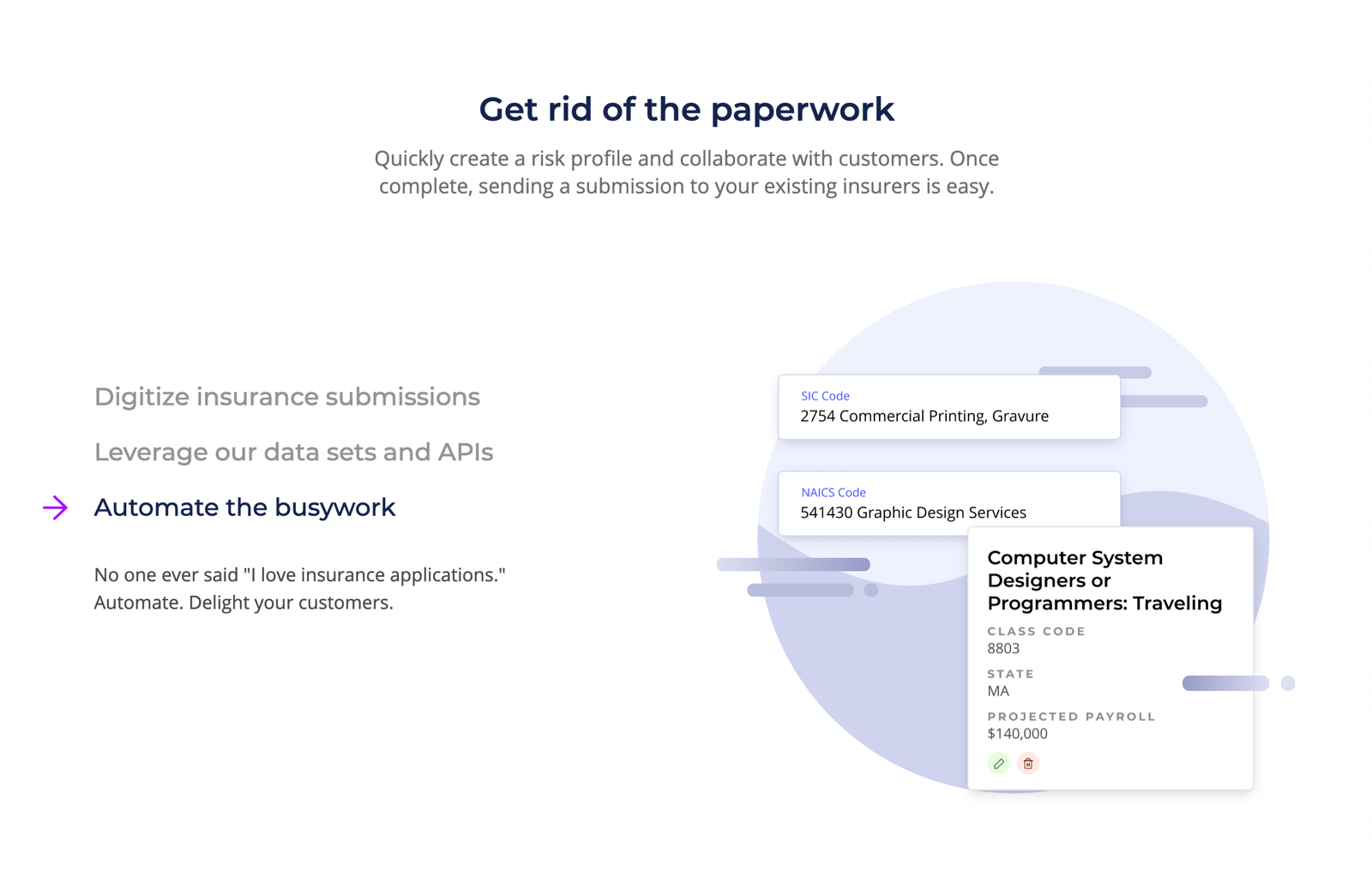
Our other main focus of the platform redesign were the forms themselves. Each risk profile needed a lot of data, and it was our goal to segment these pieces into bite-sized, comprehensible sections. We started with the introduction of a new profile creation process: a simple step form walks the user through some basics—name, description, industry codes, contact information, and collaborators. On completion of the form, the user is taken to the risk profile page, where they can begin filling out their risk data.
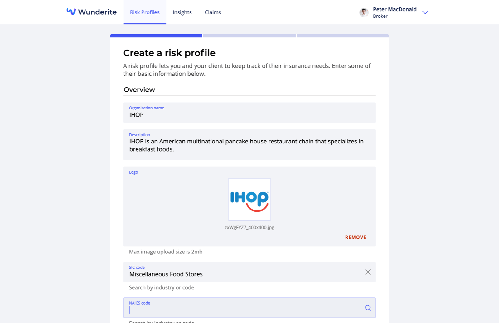
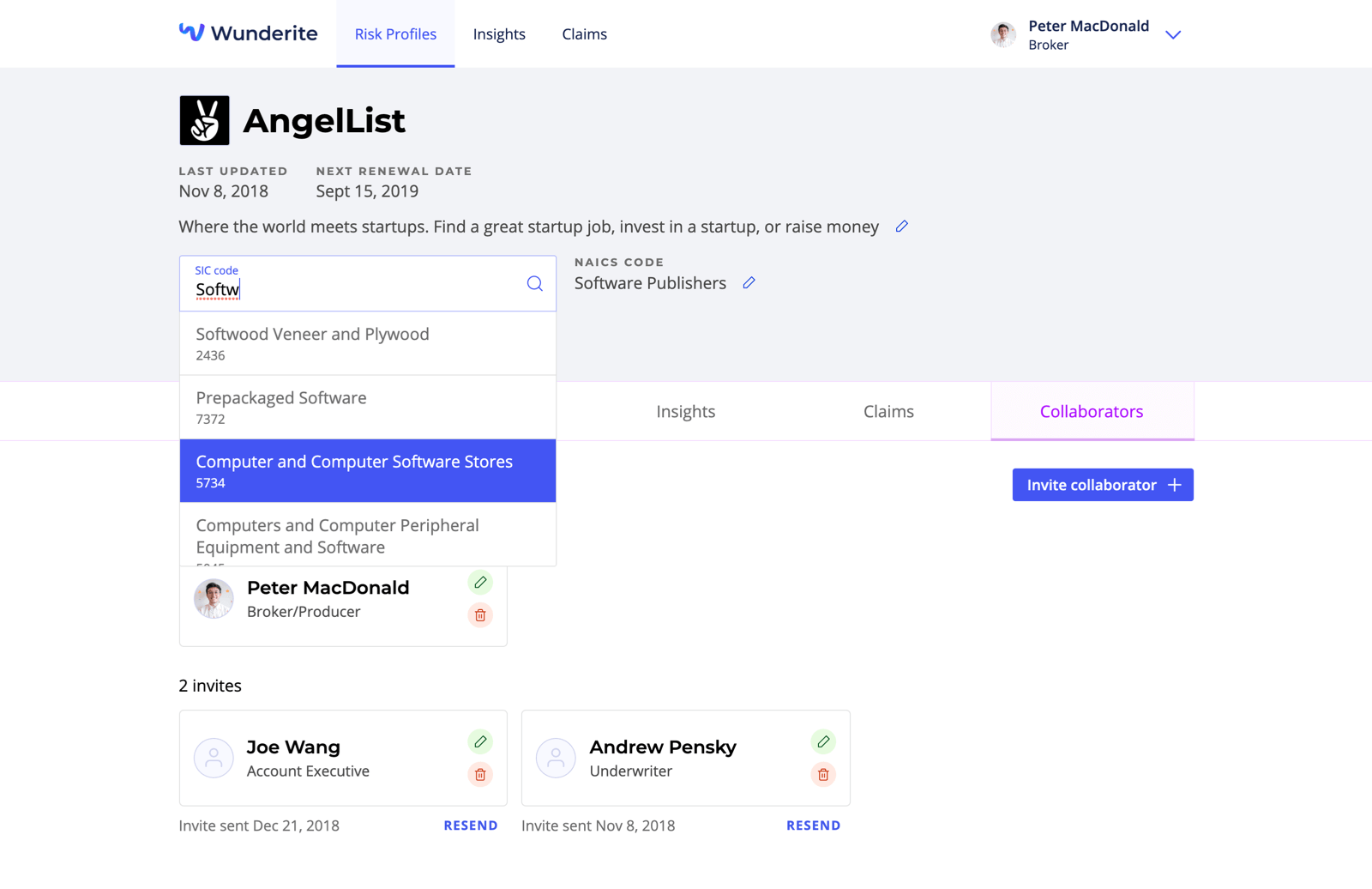
Across the entire platform, we had to account for a wide variety of information by creating custom inputs that would work for many different cases. One such case was a suggest input, where a user could begin typing a phrase and be provided with options in a dropdown. The initial use case for this was to provide options from a scraped database of industry codes that Wunderite had indexed in Algolia, allowing users to quickly and efficiently find their code without digging through pages of online resources. However, when digging into the data structures for a profile’s risk data, we found that there were some resources that had relationships to other risk data types. We thought this would be a perfect opportunity to use this suggest input again, so we set out to abstract it to work with a server-side fuzzy search using Algolia, as well as a client-side one like Fuse so we could search through our API results without straining the server. In the cases where the user couldn’t find a resource in a local search, we also added a “Create ...” option where a new form would pop over to quickly create the new resource, all without ever having to leave the initial form.

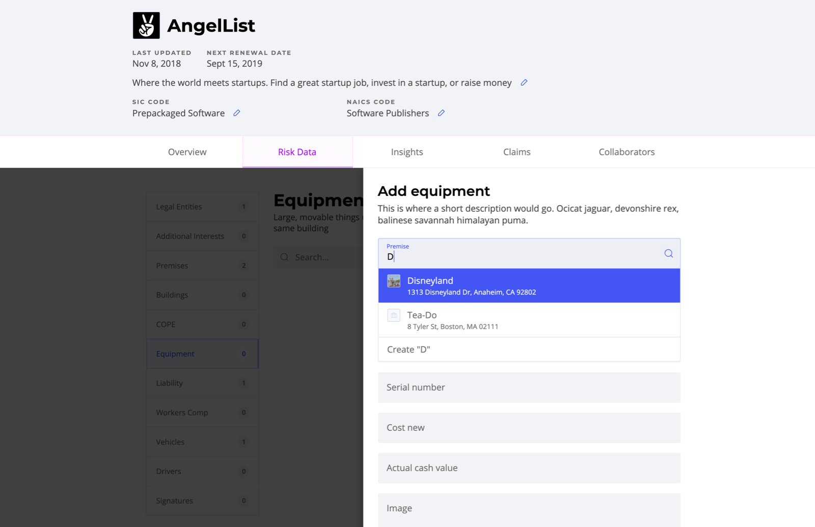
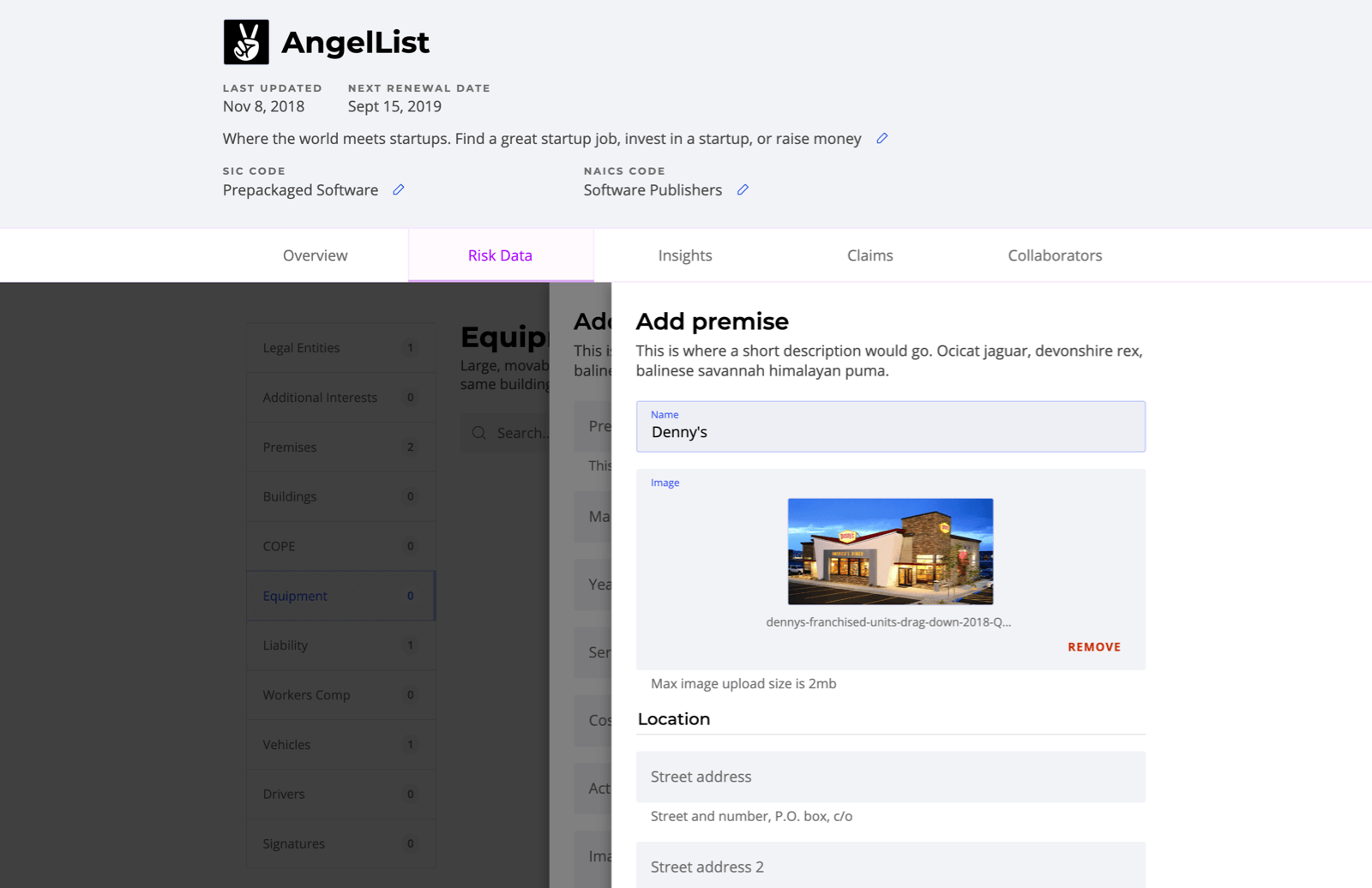
To keep the experience dynamic, we wanted all of the data in the app to feel live and editable; as such, we had come up with a design for an inline editable input. This would appear as regular text on first viewing, but, upon clicking the edit button to its right, it would transform into a custom input where you could update the data. This allowed the user to quickly update information without jumping into a modal, and gave the user immediate context to what they were editing. Since all of our custom input components shared the same base API, we could easily swap in any of them and perform the same actions to edit and save the data changes made in the input. Using Vue slots also allowed us to customize the text preview component that would appear before and after editing.
Bringing It All Together
We only had two weeks to design and build the marketing site, and as such we needed a tool that would enable quick development. We turned to Gatsby, a static-site generator for React, as our build tool. Using React meant that we could quickly create reusable components and iterate on the design quickly as it evolved over development. To ensure that our client could quickly update content, we opted to use Prismic: a headless CMS that was low-cost but had plenty of powerful content modeling tools that fit the needs of the site perfectly.
When deciding on the look and feel of the site, we knew there needed to be a flare of fun to match the personality of the new logomark. Insurance is a difficult topic to illustrate for, and we had to test many different illustration styles (including those trendy, meaningless blobs). We eventually settled on a simplified depiction of the user interface we designed, as this would give viewers of the site a quick glimpse into how simple the tool is compared to the old ways. To keep the card elements from feeling too static, we also implemented a parallax effect that moved either whole or certain parts of the elements on scroll.
Honorable Mentions
- When Wunderite first approached us, their existing platform was built using the PHP framework Laravel, with Vue as a templating layer. As a young start-up, we wanted to set them up for success, so we recommended decoupling their view and data layers to allow them to grow independently of each other. We decided on rebuilding the platform as a Vue single-page application which would interact with a REST API that their Laravel back-end could expose (we built a mock API using Node for our prototype).
- To deliver the best experience for both of our user groups, we spent a large majority of our time focused on the UX of the platform. When it came time to start designing the interface, we opted for a component-based approach. This allowed us to quickly build a library of reusable design components that could be used across all pages; it also proved to make a seamless handoff with our developers, as the use of Vue meant everyone was thinking in terms of components.
- With every new semester in Scout, we try to improve on the previous by introducing new initiatives. This semester was focused on accessibility and, as such, we put a lot of time and effort into ensuring that all parts of the site were accessible. The A11Y Project’s web checklist played a large part in every design and code review to check that our work was up to standard. For design, our largest consideration was ensuring all colors were at least AA compliant. When creating new components for the platform, we designed and implemented custom hover, focus, and active states and tested thoroughly for keyboard-only navigation.