Sports Innovation Lab is a start-up that focuses on bringing insights on the latest technology to the sports world. They approached us to reimagine their current web app in a prototype that takes advantage of the vast datasets they’ve collected and insights they’ve created.
Getting Up to Speed
Before Sports Innovation Lab approached us, they already had a working version of their app. However, with gigabytes worth of data being pushed through a static site generator, their time to rebuild and publish the app was over two hours, and this was happening three times a day. We flagged this immediately as something to improve upon in the next iteration, but before we could start looking into solutions, we first needed to understand their current stack.
Due to the sheer size of their current set-up, we had to develop new ways of technical research (some of which are illustrated in a blog post by our team’s lead developer Bea Huang). After an initial questionnaire sent out to their tech team and a deep dive into some existing code they shared, we invited their CTO to do a guided tour of their existing stack in order to better understand how all the parts of their product work together. From this, we were able to identify problem areas and solutions we could introduce. With the information gathered from these activities, we had enough knowledge to make an informed decision on what their future stack should look like.
In order to alleviate the build time problem, we knew immediately that we needed to move them to a more dynamic solution, of which we chose React. Since the dynamic app would call for the need of APIs, their CTO requested that we obfuscate all service requests; for this, we chose to use Netlify Lambda as a middle man for requesting data. Working with Bea, I created a new flow diagram that illustrated how their existing services could fit in with our new vision for the dynamic app. After receiving approval from their CTO, we set off to work.
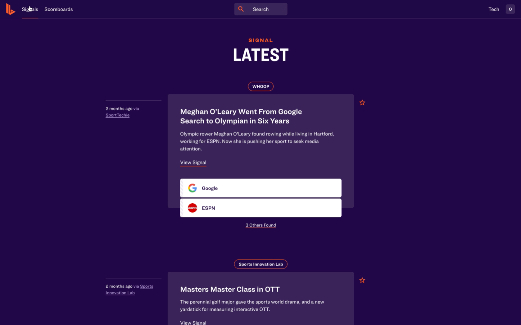
Designing the Feeds
When initial conversations of the app rebuild began, their CTO expressed interest in using a service called Stream, whose specialty was in creating Twitter-like feeds. Since we were planning on creating research feeds for different technologies and capabilities in the sports tech world, we agreed to research more about how to use it. After creating some test applications to measure its viability, we decided to move forward with using it.
With most of the pages within the app revolving around data in these feeds, we decided to double Stream as a feed aggregator and database using Stream collections. By storing data inside Stream, we’re able to link this data to feed posts using IDs and automatically enrich the posts with the real data once the feed is fetched. We created a local mock application that demoed this functionality, then created documentation to hand off to their team for implementation of their data with the Stream service. Once their data started streaming in, we were able to fetch it through dedicated Stream lambdas and connect it to our custom React components.
Shareable Modals
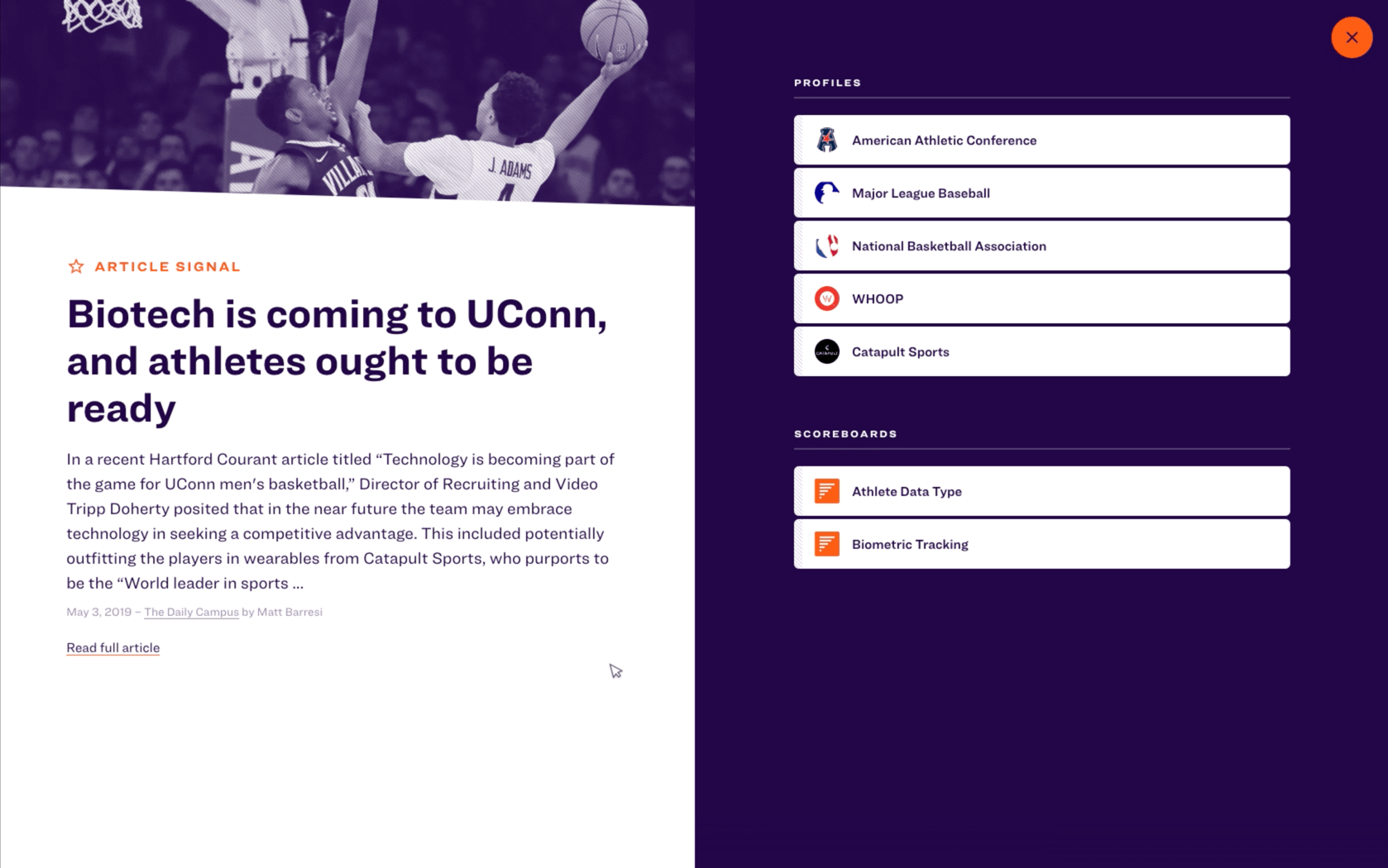
Partway through the engagement, an idea was sprouted that the posts in the feed could have their own view that provided more information about it. This posed a problem in the current design of the feeds as they were built to scroll ad infinitum, so redirecting to a separate post view would lose the user’s scroll position in the feed. To remedy this, we introduced Twitter-like modals: when a post is clicked, the URL changes but the page remains the same, only with a modal on top; if the page is refreshed, however, the modal content becomes the content of the entire page.
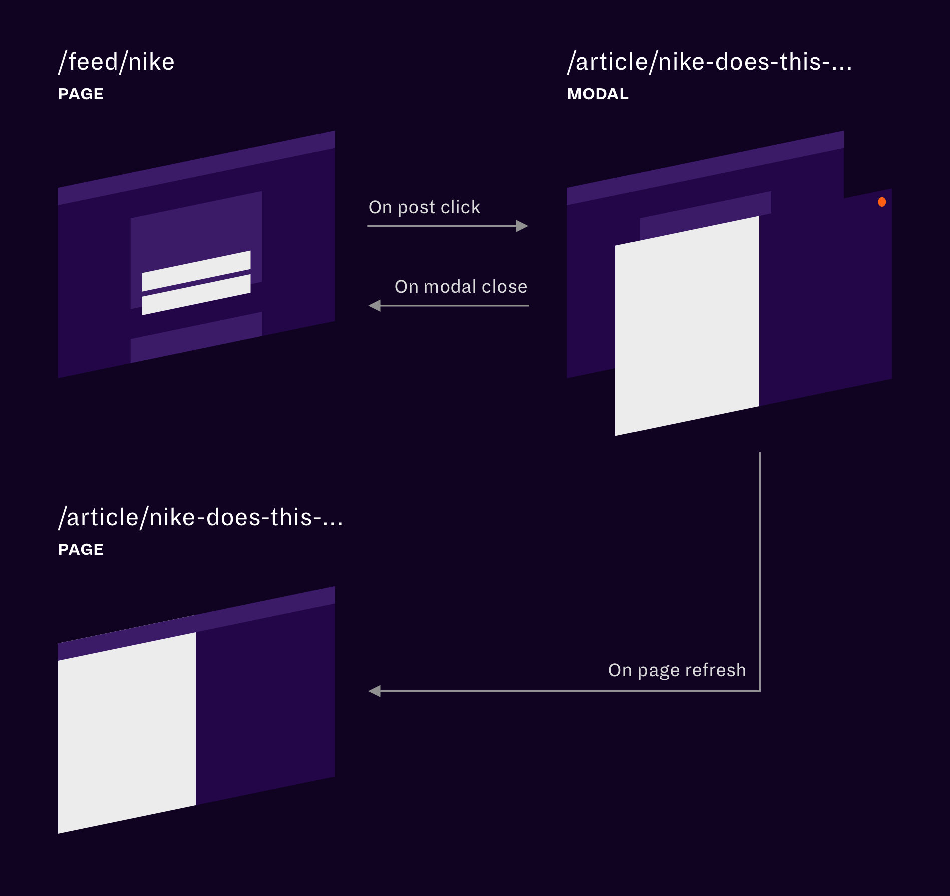
Since we were using React Router as our routing solution, I drummed up a solution that used the state property of a link to inform the router if the link was for a modal. If a link was clicked where the modal property was true, it would pause rendering of the current page, update the URL, and open a React Portal to render the modal; the opposite would happen when the modal was closed, in which the URL would revert back to the current page’s and the scroll would remain preserved. We added this logic to a custom Switch component which would also keep track of the previous and modal locations. What we’re left with is a link that can open a modal with a unique, shareable URL, that can be closed like any other modal.
Visualizations For Every Screen
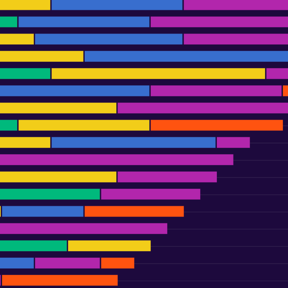
Sports Innovation Lab had a lot of data to show, but with no good visual way to do so. Working in collaboration with their lead researchers, we were able to understand what data was more important to their clients and narrow down the ways to visualize that data that would be most helpful to them. We landed on two different types of visualizations: scoreboard charts and connection graphs.
- Scoreboard charts were bar charts that ranked companies based on their use of a given technology or capability; they also featured a “leaders” line which marked the point at which a company could be considered a leader in that given market.
- Connection graphs were treemaps that showed a company, person, or technology’s closest linked companies, people, and/or technologies.
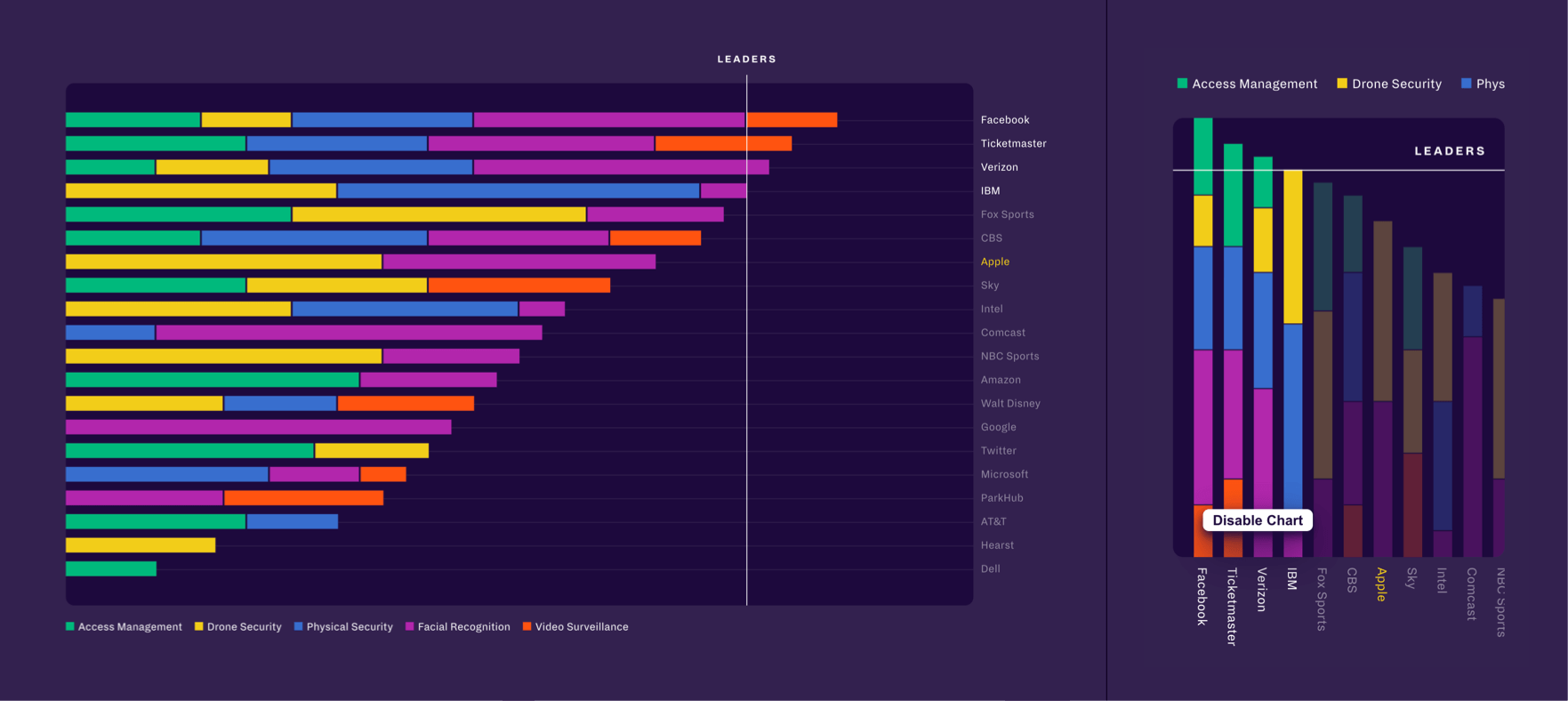
A problem that we found a lot of visualizations have is the lack of responsivity; that is, the inability to properly scale the chart or graph to respond to the size of the device, all the while keeping the scale of text and other elements to match that of proper elements on the rest of the page. I was placed in charge of this effort using D3, and, after some initial testing, found a single solution that could be applied to both types of visualizations. Instead of assigning a static viewbox width that would cause the chart to scale, we can set the viewbox width to the current width of the window. Then, we attach a resize listener to the window that would re-render the chart. All in all, it looks something like this:
import React, { useEffect, useRef, useState } from 'react';import { select } from 'd3-selection';const Chart = ({ height }) => {const svg = useRef();const [innerHeight, setInnerHeight] = useState(height);const [innerWidth, setInnerWidth] = useState(window.innerWidth);const renderChart = g => {// ...};const createChart = () => {select(svg.current).attr('preserveAspectRatio', 'xMinYMin meet').attr('viewBox', `0 0 ${innerWidth} ${innerHeight}`).attr('height', `${innerHeight}px`).selectAll('g').remove();const g = select(svg.current).append('g');renderChart(g);}const onResize = () => {setInnerWidth(window.innerWidth);};useEffect(() => {createChart();}, [innerWidth]);useEffect(() => {window.addEventListener('resize', onResize);return () => {window.removeEventListener('resize', onResize);};}, []);return <svg ref={svg} />;};
To see the responsive charts in action, check out the “Scaling the experience for any device” section I built for Upstatement’s case study!
Learnings
This was my first full project at Upstatement and, as such, I learned a whole lot about all parts of the process. I was given a ton of responsibility, including setting up the app scaffold, handling service integrations, creating responsive charts, and so much more. I even was able to create an open-source library from it all! All in all, working on this project might have been my favorite experience during my apprenticeship, and I look forward to more projects like it.